
Every KPI and graph on the page responds to the same filter bar at the top, so scope the whole view to the segment you want before you start reading the numbers.

You can filter all graphs by:
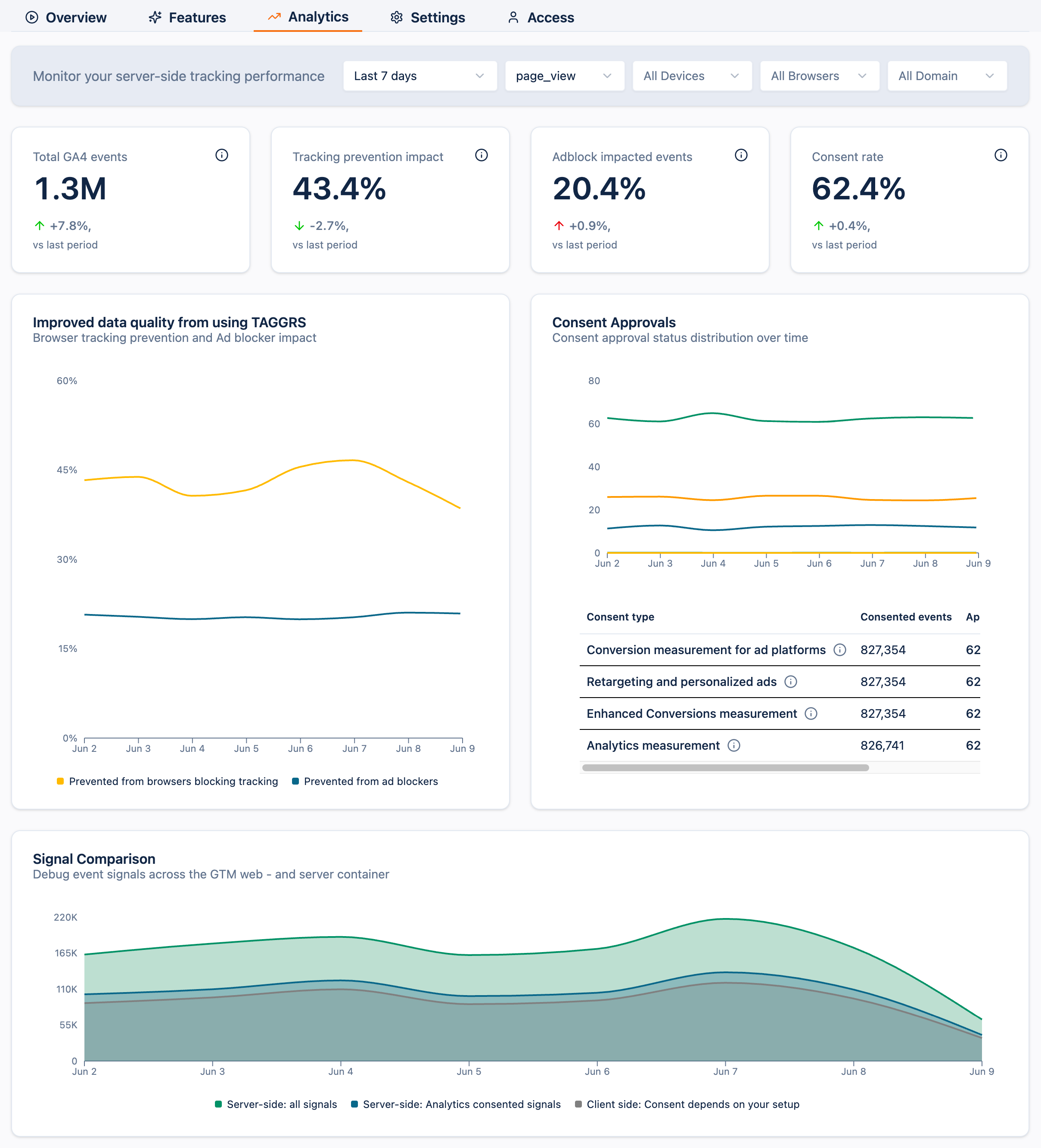
The 4 tiles at the top are your headline metrics. Each one shows the current value for the active filters and its change versus the previous period of the same length.
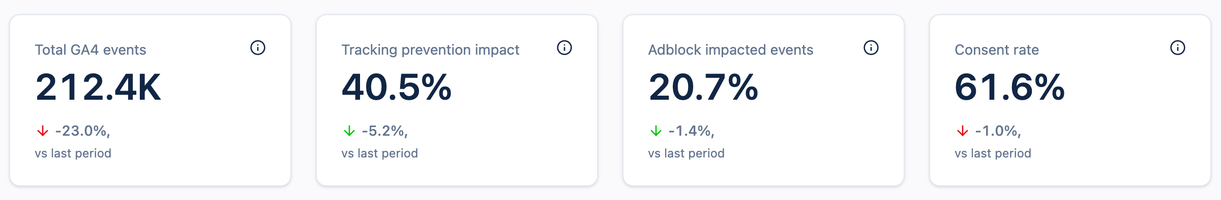
A quick word on the trend colours, because up is not always good:
• For Total GA4 events and Consent rate, an upward trend is healthy and shown in green.
• For Tracking prevention impact and Adblock impacted events, an upward trend is shown in red. A rise here means more of your traffic is exposed to data loss, data that TAGGRS is recovering on your behalf, but a signal worth watching all the same.
The total number of GA4 events captured server-side for the selected scope. This is your baseline volume.
Read it as: your headline activity number. Compare it against the previous period to catch unexpected drops or spikes.
What to do when it moves: a sudden drop usually means a tag stopped firing or a deploy broke something. Switch to Last 24 hours, filter by Event name, and find which event fell.
Drill into: Signal Comparison and Request distribution.
The share of events that browser tracking-prevention features (Safari’s ITP, Firefox’s ETP, and similar) would have blocked on a client-side-only setup, but that TAGGRS still captures server-side.
Read it as: how much of your audience sits behind browser privacy protections and how much data those protections would otherwise cost you.
What to do when it moves: check whether your browser mix has shifted before assuming a tracking problem.
Drill into: Improved data quality and Browser Analytics.
The share of events that ad blockers would have blocked without server-side tracking, recovered through the TAGGRS Enhanced Tracking Script.
Read it as: data a purely client-side implementation would have lost silently, now recovered.
What to do when it moves: a rising figure is a strong signal of the value server-side tracking is adding, confirm the Enhanced Tracking Script is deployed across every page.
Drill into: Improved data quality.
The percentage of users who fully granted consent, an at-a-glance health check on your consent configuration.
Read it as: a stable or rising rate is healthy; a sudden drop points to a consent management platform (CMP) or banner problem.
What to do when it moves: open the per-type breakdown to see which consent category dropped, rather than treating it as one site-wide number.
Drill into: Consent Approvals.
Each graph below the KPIs is the detail view behind one or more tiles. Use them to find the cause of a change and decide what to do next.
Drills into:Tracking prevention impact and Adblock impacted events.
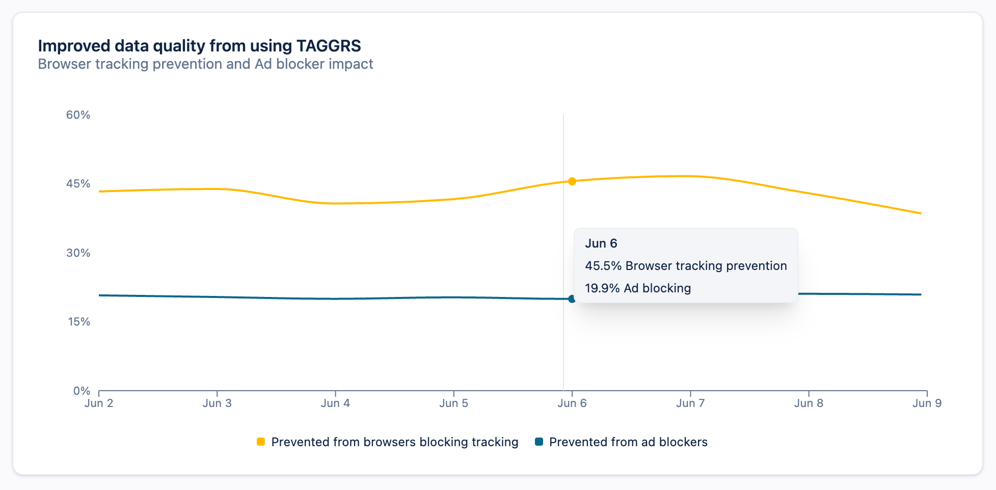
This graph plots two recovery lines over time:
• Prevented from browsers blocking tracking: events recovered from browser tracking prevention. This is the detail behind the Tracking prevention impact KPI.
• Prevented from ad blockers: events recovered from ad blockers. This is the detail behind the Adblock impacted events KPI.
How to use it: when either KPI moves, open this graph to see whether the change is a one-day spike or a sustained trend, and which of the two recovery sources is responsible. A sharp single-day jump in the ad-blocker line, for example, often maps to a campaign that drove privacy-heavy traffic.
Context for:Tracking prevention impact.

Browser Analytics shows your visitors’ browser mix for the selected period. Tracking prevention affects every major browser except Chrome: Safari’s Intelligent Tracking Prevention, Firefox’s Enhanced Tracking Protection, and so on. The larger your non-Chrome share, the more exposure you have to client-side data loss, and the more value you gain from Server-side Tracking.
How to use it: treat this as the explanation behind your Tracking prevention impact KPI. A rise in your Safari or Firefox share will push that KPI up; a shift toward Chrome will pull it down.
Drills into:Consent rate.
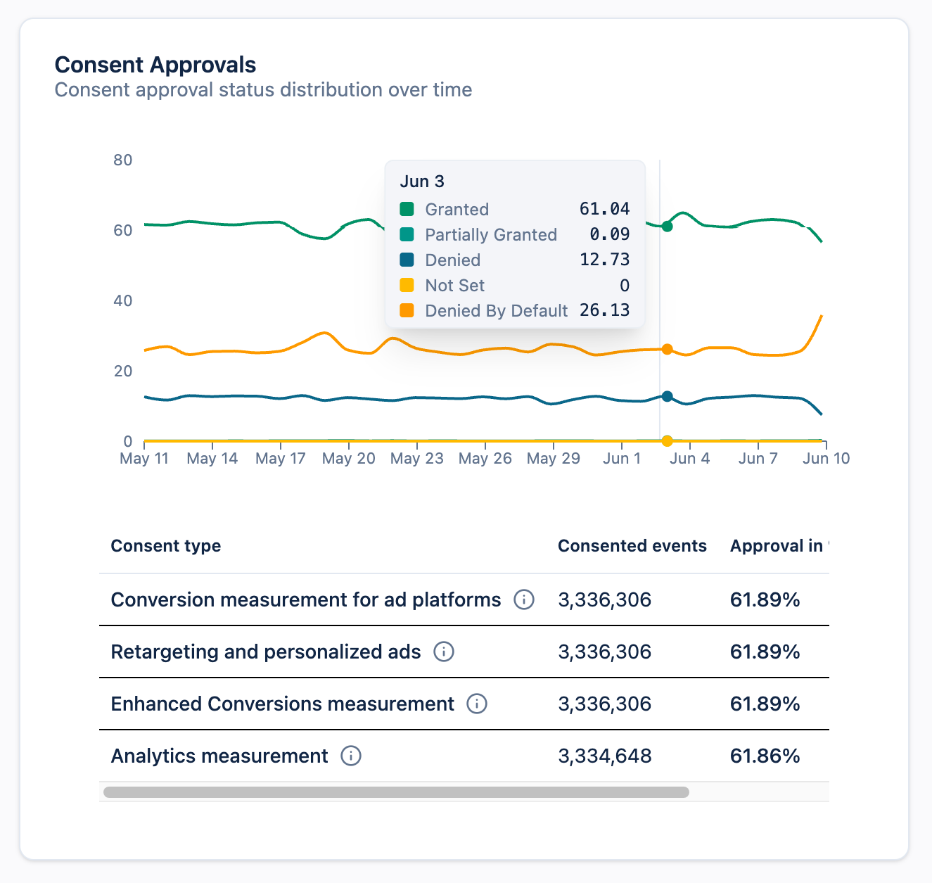
This graph breaks the single Consent rate number into its underlying states over time: Granted, Denied by Default, and Not Set.
How to use it: watch the lines for shifts rather than reading the snapshot alone. A rising Denied by Default line, for instance, can point to a CMP misconfiguration or a page where the consent banner isn’t firing.
Below the graph, a breakdown table shows the consented events, approval rate, and denied events for each consent type:
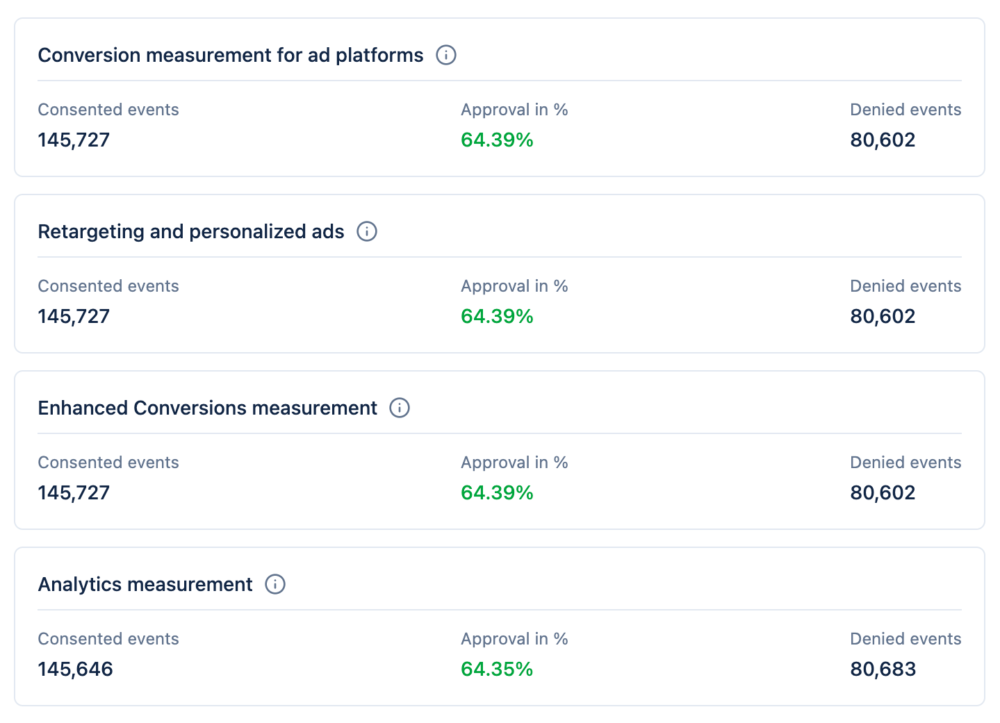
How to use it: compare approval rates across types. If one type, say Analytics measurement, sits noticeably below the others, that usually means a single consent category is misconfigured, not a site-wide consent problem.
Context for:Total GA4 events, this is where your server-side uplift comes from.
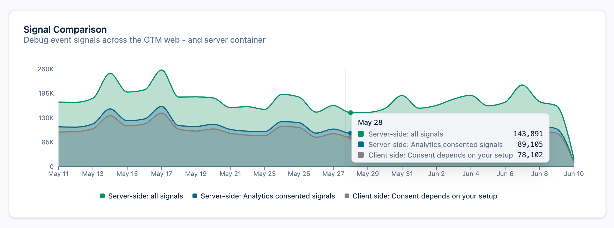
Signal Comparison shows how much data your server container captures versus a client-only setup. It plots three series:
The gap between the server-side and client-side lines is your uplift: the additional data you gain from server-side tracking.
How to use it: when Total GA4 events looks lower than expected, this graph tells you whether the shortfall is on the server side or simply reflects client-side loss you’ve now recovered. TAGGRS measures uplift directly from incoming server container data, not from your client-side tag configuration, so the figure isn’t distorted by consent issues, incorrect event handling, or misfiring client-side tags. (The client-side tag is still required to supply the client-side comparison line.)
Context for: overall traffic volume and your plan usage.

The Request distribution graph in your Analytics shows the total number of requests your server container received over time. Remember that a request is any HTTP call to the container — pageviews and Google Tag Manager client deployments (gtm.js, analytics.js, gtag.js), not only tracked events — which is why this number is higher than your Total GA4 events.
By switching the Show categories toggle in the Requests graph, you can view detailed types of requests and their sources.

The following types of requests are
distinguished:
How to use it: watch the trend for unexpected volume changes that could affect your plan usage, then switch on Show categories to see which source is driving them.
An event is a single tracked analytics or conversion hit, such as page_view or purchase, that’s what your KPIs count. A request is any HTTP call your server container receives, including script loads and cookies, so it’s always a larger number. Only the Request distribution graph counts requests; everything else on this page counts events.
Your usage is calculated automatically and shown at the top of your account. It mainly depends on the number of clients you use (e.g. GA4), your website or app traffic (pageviews), and the number of additional events you track (such as e-commerce events). Want a detailed breakdown? See our page on Server-side Tracking costs.
TAGGRS uplift measurement is based directly on incoming server container data, rather than on your client-side TAGGRS tracking tag configuration. This makes it significantly more reliable: your uplift figures are no longer affected by consent issues, incorrect event handling, or client-side tag misconfigurations. The client-side tag is still needed to provide the client-side comparison data in the Signal Comparison graph.